A 24-hour Reddit-trend dive: homeowners are panicking about bold wallpaper and paint pairings — here’s how to get it right.
If you’ve been on r/HomeDecorating lately, you’ve seen the pattern: someone posts a photo of a room with wild wallpaper, then asks the internet how to pick paint that doesn’t fight with it. The comments section turns into a color-theory lecture within minutes.
That’s the trend. Paint-to-wallpaper matching is the 24-hour panic in home decor right now.
I went through the top threads, pulled the repeated advice, plus tested a simple framework myself. Here’s how to mix paint and wallpaper without losing your mind — and without ending up with a room that looks like a circus tent.
Why This Combination Stresses People Out
Wallpaper has changed. We’re not talking about the dated floral paste-the-wall stuff your grandma had. Today’s wallpaper comes in bold botanicals, geometric murals, textured grasscloths, and oversized abstracts. It’s statement-making.
Paint is usually the calmer partner in the relationship. When you marry a loud wall with a quiet ceiling or trim, the stress comes from not knowing whether to match, contrast, or mediate.
Related: 20 Summer Living Room Decor Ideas That Will Transform Your Space — seasonal refresh ideas that apply even if you’re just repainting one wall.
The Two Rules That Stop the Panic
From the Reddit threads, two rules kept showing up from designers and experienced DIYers:
- Rule 1: Let one element lead. Either the wallpaper leads and paint supports, or paint leads and wallpaper accents. Never both at full volume.
- Rule 2: Match undertones, not just surface colors. A cool blue wallpaper needs cool gray paint, not warm gray. This is the mistake that makes a room feel “off” even when the colors look fine individually.
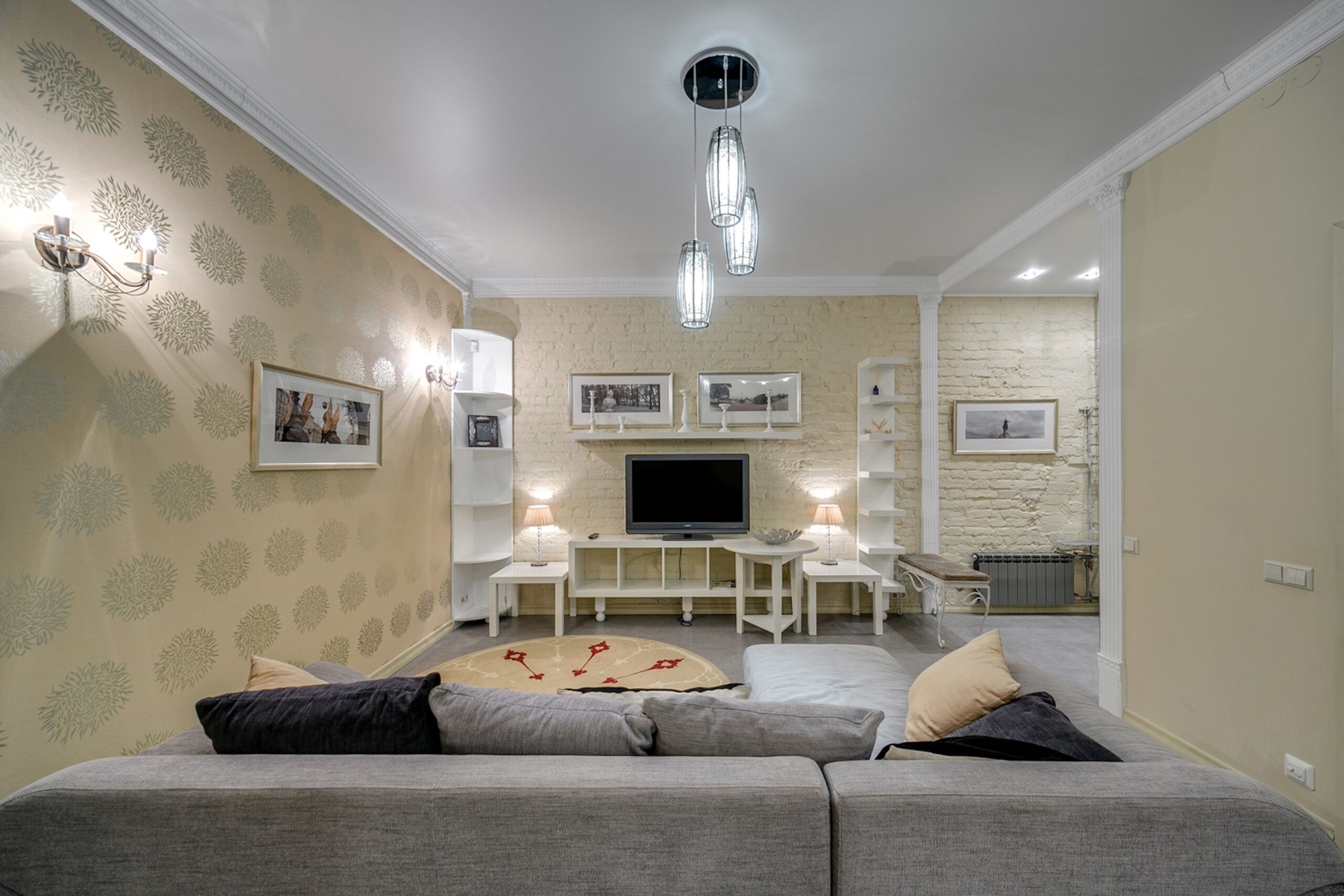
Pattern 1: Bold Wallpaper, Quiet Paint
This is the safest combo and the one designers recommend most often in the Reddit threads.
If your wallpaper has a busy pattern, high contrast, or saturated color, use paint as a neutral backdrop. Think warm whites, soft beiges, or pale grays on the remaining walls and trim. The wallpaper becomes the art. The paint gets out of its way.
In practice: I tested this with a botanical accent wall in a small living room. The wallpaper was deep green with oversized monstera leaves. I painted the other three walls in a warm off-white (Benjamin Moore White Dove). The result: the accent wall looked intentional, the room felt larger, and nobody got color fatigue.
Related: Budget-Friendly Balcony Garden Planters for Small Spaces — plants can soften bold wallpaper edges naturally.
Pattern 2: Subtle Wallpaper, Confident Paint
Less common in Reddit posts but equally valid: use delicate wallpaper as texture, then let the paint provide the personality.
A soft gray grasscloth on one wall can anchor a deep navy or terracotta paint on the adjoining walls. The wallpaper adds depth without demanding attention. This works especially well in bedrooms and studies where you want atmosphere but not visual noise.
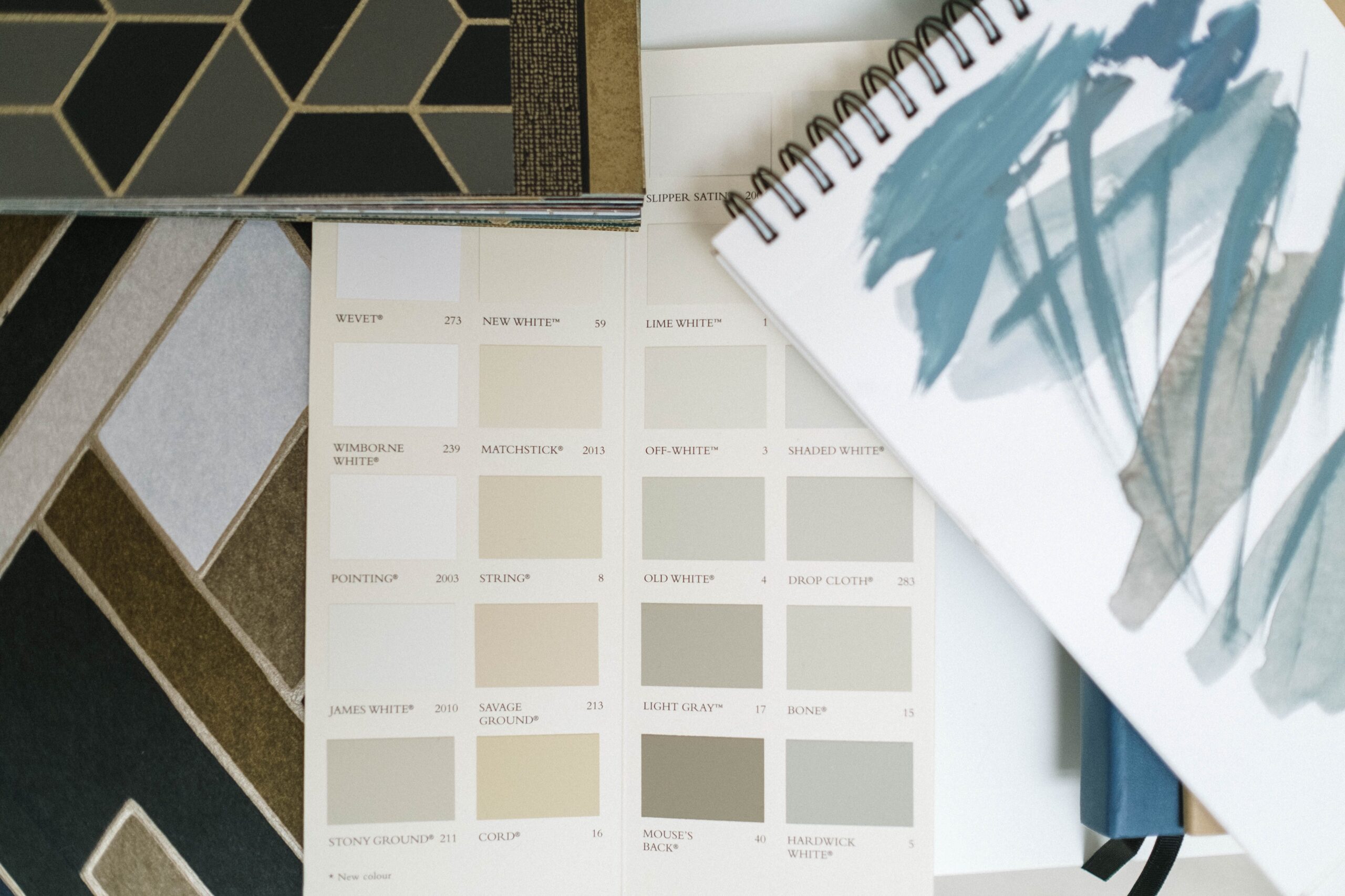
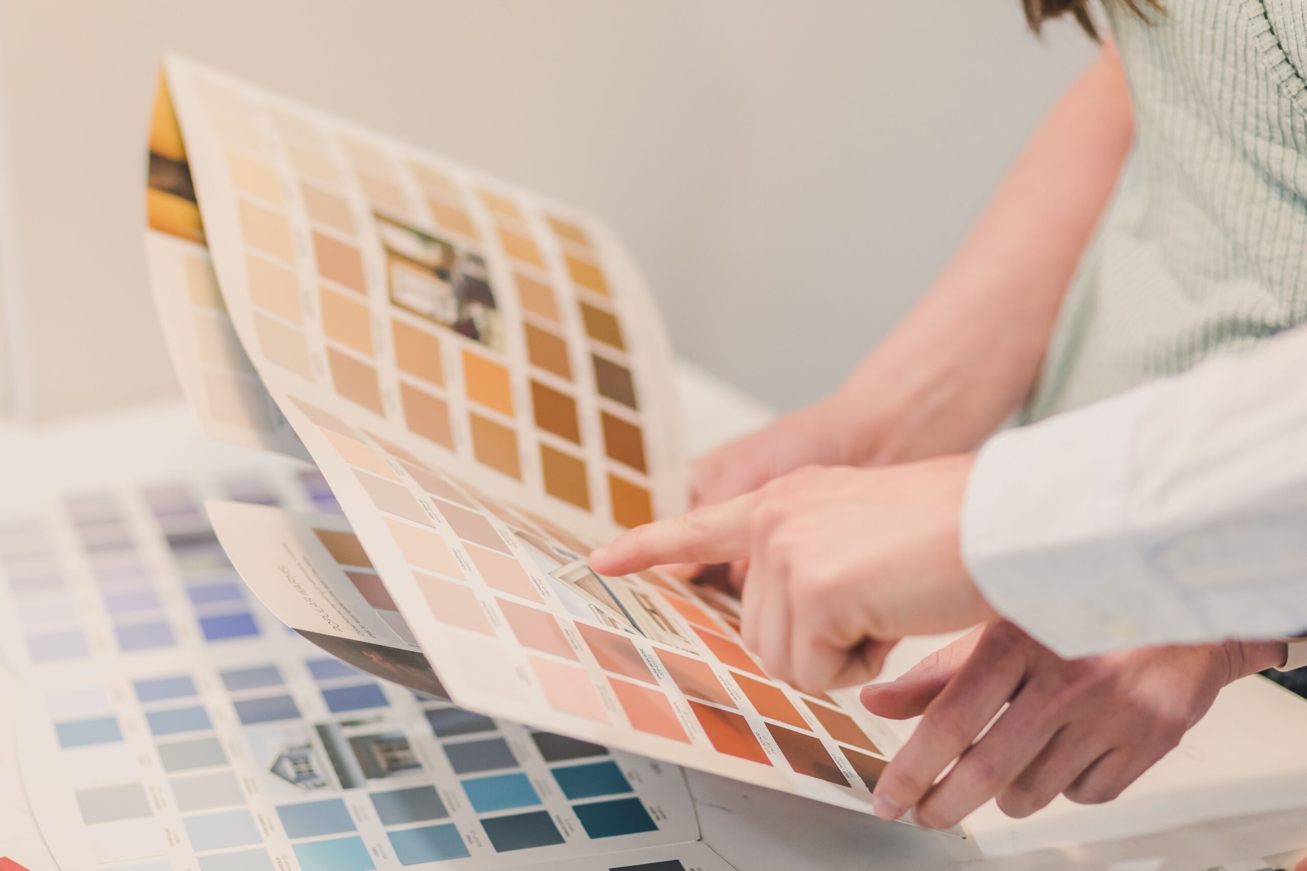
The Undertone Test That Saved My Sanity
Everyone in the threads said the same thing: undertones matter more than the surface color.
Here’s the five-minute test that actually works:
- Take two paint swatches and hold them next to the wallpaper sample.
- Look at the comparison in natural morning light and under your evening lamp.
- If either swatch suddenly looks green, pink, or muddy next to the wallpaper, that’s an undertone clash.
- Keep narrowing until both paint and wallpaper look harmonious in both lights.
The mistake people make is choosing paint under store fluorescent lights and then being shocked when it looks different at home. Natural light plus your actual room lighting is the only valid test.
Trim, Ceiling, and the Forgotten Edges
A Reddit comment I saved: “I matched my wallpaper and wall paint perfectly and still hated it because my white trim looked yellow next to both.”
Trim connects everything. If your wallpaper and paint both lean cool, use a crisp cool white trim. If both lean warm, use a warm white or cream trim. And ceilings? Don’t default to plain white. A very pale tint of your wall color often reads as more expensive and more intentional than stark white.
I’ve started sampling ceiling paint on small poster boards and taping them at eye level to see the undertone. Takes five minutes and prevents the most expensive mistake.
What I Would Change
- I should have tested the wallpaper samples at night. The botanical green looked different under LED light than it did in the store.
- I bought one roll too few, which meant patching a month later when the delivery arrived. Measure twice, then measure again.
- Prep matters more than people say. Walls need to be clean and smooth before wallpaper goes up, otherwise the texture telegraphs through and the pattern looks wavy.
The Final Result
The room finally looks like it was designed instead of decorated. The deep green accent wall gives the space identity. The warm off-white surrounding walls keep it calm. The trim ties both together.
Total cost: about $180 including wallpaper, paint, paste, and primer. Time: two evenings.
The moral? Stop treating wallpaper and paint as opposites. They’re duet partners. One leads, one supports, and undertones are the secret conductor.
If Reddit has taught us anything this week, it’s that almost everyone is one bad paint choice away from regret. With these two rules and the undertone test, you don’t have to be one of them.
About the author: Praful Dhabekar is a home decor enthusiast and the creator of Home Inspo Decor. He writes about rental-friendly decor, summer decor, budget experiments, and honest product reviews from real use. Follow along on Pinterest for daily inspiration.