Planning to repaint your living room this year? You’re in the right place. 2026 is a fantastic year for living room colors — designers are moving away from cold, sterile grays and leaning hard into warm, earthy, feels-like-home shades that make you actually want to curl up on the couch.
Whether you want something safe and timeless or a color that makes a real statement, here are the best living room paint colors for 2026 — with exact paint names so you can walk straight into the store.
1. Warm Neutrals — The Reliable Crowd-Pleaser
If you’ve been living with cool gray walls, 2026 is your sign to warm things up. Designers are replacing cool gray with warm neutrals that make living rooms feel comfortable without looking dated.
Think soft beiges, creamy off-whites, and warm greige tones. These colors do something cool gray never quite managed — they make a room feel genuinely inviting rather than just modern.
Our top picks:
- Sherwin-Williams Alabaster (SW 7008) — This soft, warm off-white adapts beautifully to different lighting conditions and creates a calm, inviting foundation without reading stark or cold. It works especially well in living rooms because it allows furnishings, art, and architectural details to stand out while still feeling cozy and layered.

- Sherwin-Williams Universal Khaki (SW 6150) — A mid-tone neutral that pairs beautifully with a wide variety of other colors. Yes, beige is back — but it feels new and fresh, with just enough warmth to keep a room cozy while still reading sophisticated.
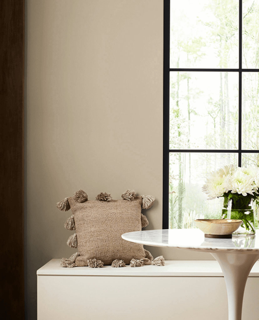
Best for: Homes with natural wood furniture, linen sofas, or anyone who wants a timeless backdrop that never goes out of style.
2. Earthy Greens — Nature’s Favorite Neutral
Green has quietly become the most versatile color in home decor, and it’s showing no signs of slowing down in 2026. Earth-inspired greens dominate because they feel calming and organic, mimicking natural environments and pairing beautifully with materials like wood, stone, and linen.
The key is to go earthy and muted rather than bright or grassy. Think sage, olive, and moss — colors that feel like a walk in the woods rather than a school gymnasium.
Our top picks:
- Valspar Sage Slate — Valspar’s 2026 Color of the Year, described as naturally restorative and serene, inspired by mindful living and the desire to slow down time with restorative design.
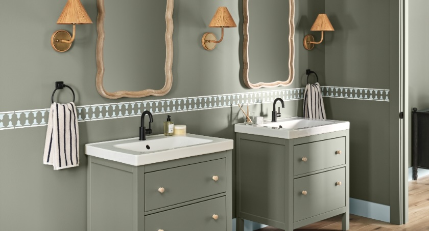
- Benjamin Moore Salamander — a deep, rich olive that adds serious drama without feeling heavy when balanced with light furniture and natural textures.

Best for: Living rooms with wood floors, rattan accents, plants, or a Japandi / Bohemian vibe.
3. Teal — Bold but Surprisingly Livable
If you want a color that makes people stop and say “wow” when they walk in, teal is your answer for 2026. Teal manages to feel calming and bold at the same time, and feels more current than dark green walls. It bridges the gap between blue and green, ranging from dark and moody to muted and tranquil.
The trick is to pick a teal with a dose of gray in it — this keeps it from feeling too tropical and makes it work year-round.
Our top picks:
- Benjamin Moore Atmospheric (OC-28) — A blue-green hue that serves as an excellent backdrop to layer great pattern and color into the room.
- Farrow & Ball Dix Blue — muted, sophisticated, and looks stunning paired with warm caramels and soft pinks.
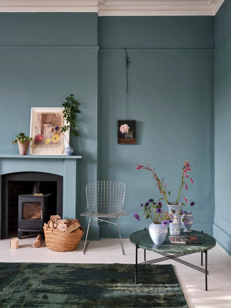
Best for: Living rooms with plenty of natural light, white trim, and neutral furniture. Pairs beautifully with gold or brass hardware.
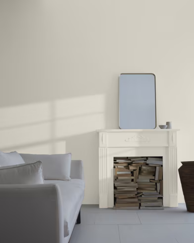
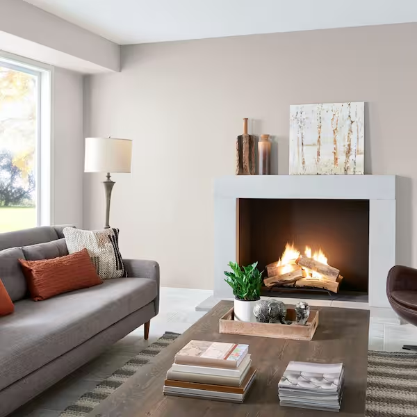
4. Warm Whites — Brighter Than Beige, Softer Than Bright White
While we are seeing fewer bright white rooms in 2026, warmer whites are a timeless living room color trend for 2026 and beyond — offering softness and more coziness than bright whites, allowing furniture, decor, and accent colors to shine.
This is the sweet spot for anyone who loves a light, airy room but finds pure white too harsh. Warm whites work in every season, photograph beautifully, and are one of the best choices if you ever plan to sell your home.
Our top picks:
- Benjamin Moore White Dove (OC-17) — endlessly popular for a reason. Warm enough to feel cozy, light enough to make any room feel bigger.
- Sherwin-Williams Creamy (SW 7012) — slightly more yellow-toned, perfect for rooms that don’t get a lot of direct sunlight.
Best for: Small living rooms, dark apartments, or anyone who wants maximum flexibility with furniture and decor changes down the road.
5. Terracotta & Clay — Earthy, Warm, and Very 2026
Clay colors and gentle terracotta shades are especially appealing in 2026 — warmer and softer than classic orange tones, giving a homey feeling and character to the room while feeling connected to the earth and currently very on trend.
Don’t be intimidated by terracotta — the 2026 version is much more muted and dusty than the bold oranges of the past. Think sun-baked clay, not a pumpkin.
Our top picks:
- Behr Burnished Clay — warm, grounded, and beautiful against white trim and dark wood furniture.
- Sherwin-Williams Reddened Earth — a complementary shade that creates a beautiful sunset effect when paired with lighter neutrals, absorbing light in a way that makes the room feel like a peaceful retreat.
Best for: Living rooms with a Southwestern, Mediterranean, or maximalist style. Also stunning as an accent wall behind a fireplace.
Before You Buy: Figure Out How Much Paint You Need
Nothing derails a painting project faster than running out of paint mid-wall — or over-buying and wasting money on gallons you’ll never use.
Before you head to the store, use our free Room Paint Calculator to find out exactly how many gallons you need based on your room’s dimensions. It takes 30 seconds and even gives you cost estimates by brand.
Final Thoughts
The best living room paint color for 2026 is one that makes you feel good every time you walk in — not just one that looks good in a magazine. Use the color guide above as a starting point, grab a few peel-and-stick samples from your local hardware store, and live with them on the wall for a couple of days before committing.
Happy painting! 🎨